


In Forex trading, charts are important because they show you how the price of a currency pair moves over time. They help traders see patterns, find trends, and make smarter decisions. There are several types of Forex trading charts, and each type shows price movements differently. Learning how to read these charts is one of the first steps if you want to trade well.
Key Takeaways
- Forex charts show currency price movements clearly.
- Each chart type provides different information to traders.
- Choosing the right chart depends on your trading style and needs.
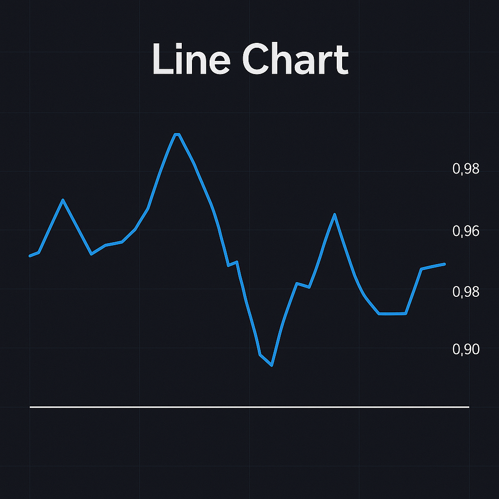
Line Chart
A line chart is the simplest way to see price movement. It connects the closing prices of a currency pair over a set period using a smooth, continuous line. On this chart, each point represents the closing price for that time period, such as one minute, one hour, or one day. When you connect all these points together, you get a clear picture of the general direction the market is moving. This makes it easy to spot whether the price is generally going up, down, or moving sideways. However, it does not show you the full story because it ignores the highest, lowest, and opening prices during each time period. It focuses only on where the market closed.
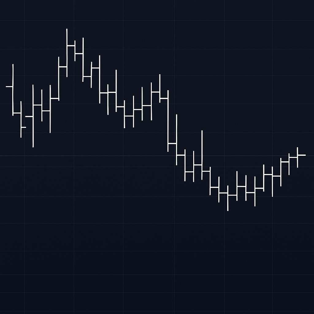
Bar Chart
A bar chart gives more detailed information about price action during each time period. Each bar represents a complete set of information: the opening price, the highest price, the lowest price, and the closing price. The top of the bar shows the highest price reached during that time, while the bottom shows the lowest price. A small dash to the left of the bar indicates where the price opened, and a small dash to the right shows where it closed. This allows traders to see not just the trend, but also how much the price moved during each period and whether the market had a strong push in one direction. Even though it looks more complicated than a line chart, it offers a deeper view of market behavior.
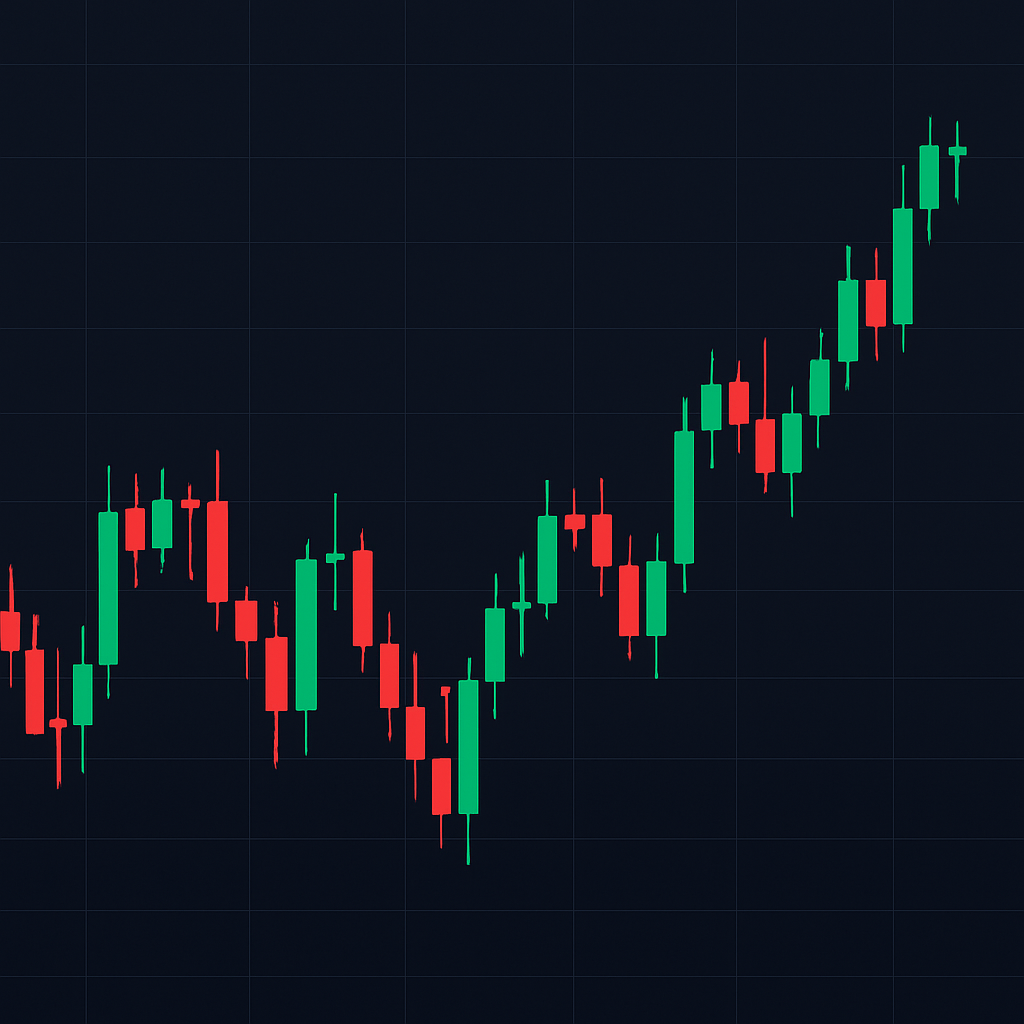
Candlestick Chart
The candlestick chart is very popular among Forex traders because it presents the same information as a bar chart but in a more visual and easy-to-read way. Each candlestick shows four main pieces of information: the open, close, high, and low for the time period. The wide part of the candle, called the “body,” shows the range between the opening and closing prices. If the closing price is higher than the opening price, the candle is usually colored green or white to show that the price went up. If the closing price is lower than the opening price, the candle is often colored red or black to show that the price went down. The thin lines sticking out from the top and bottom of the candle, called “wicks” or “shadows,” show the highest and lowest prices reached. This chart makes it easier to quickly recognize trading patterns and judge the strength of a price move.
Point and Figure Chart
A point and figure chart is a type of chart that many traders often skip when first learning how to read Forex trading charts. Even though it is not as popular as candlestick or line charts, it can still provide useful insights and serve as a good supplement to other chart types.
This chart uses the same x and y-axis setup as a line chart, but instead of drawing a line, traders use marks. An “X” mark is placed when the price rises, and an “O” mark is placed when the price falls. You might see several “Xs” stacked vertically when the price keeps moving up or several “Os” stacked downward when the price continues to fall. The line goes from the lowest to the highest price during the selected timeframe, but it does not move horizontally unless the direction of the price changes.
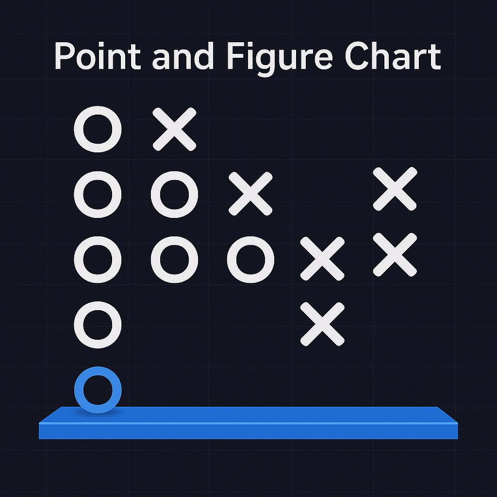
Traditionally, point and figure charts were used for one-day timeframes, where each line of Xs or Os represented the price action for an entire day. However, modern traders sometimes adjust the timeframe to match shorter or longer trading periods. A point and figure chart is very useful for traders who want to hand-draw their charts, spot simple price movements easily, or get basic insights into how the price moves within the day without being distracted by time-based noise.
Mountain Chart
A mountain chart is almost the same as a line chart, but there is one important difference. In a mountain chart, the area underneath the price line is filled with a darker color, making it look like a shaded mountain. This shading makes the trend easier to see, especially for those who prefer a more visual and bold design compared to a simple line.
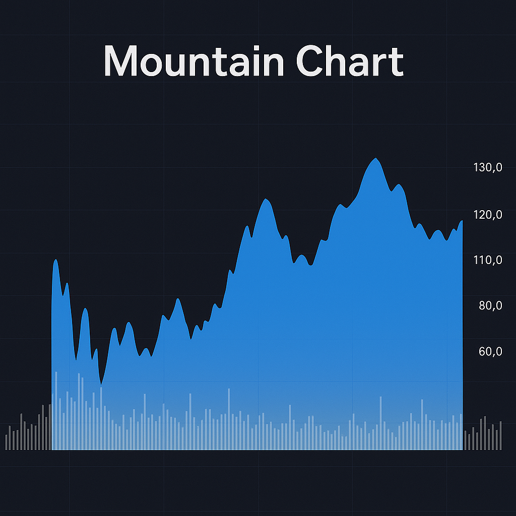
Some traders like using mountain charts because the shaded area makes it easier to read the overall direction of the price. However, mountain charts are not ideal for day trading because they do not show detailed price action for each time unit. They mainly focus on the closing prices over time. Many traders use mountain charts to spot long-term trends or to confirm insights they have found from other types of Forex trading charts. They are helpful when you want a quick and clear view of whether the market is trending up or down over a longer period.
Renko Chart
A Renko chart works very differently compared to the other charts because it does not focus on time. Instead, it creates new blocks or “bricks” only when the price moves a certain amount up or down. For example, if you set a Renko chart to 10 pips, a new brick will appear once the price moves 10 pips higher or lower than the previous brick. If the price keeps moving in the same direction, bricks will continue to form in a straight line. If the price reverses by the set amount, a new brick will be placed in the opposite direction. This type of chart ignores minor price fluctuations and focuses only on meaningful price movements, making it easier to spot strong trends without the noise.
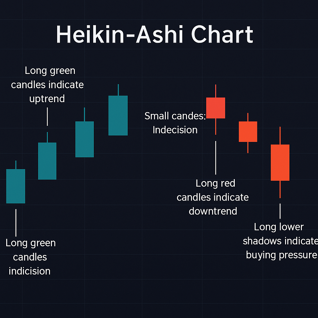
Heikin Ashi Chart
A Heikin Ashi chart looks like a regular candlestick chart but it is calculated in a special way to smooth out price movements. Instead of using the actual opening and closing prices, it takes an average of the previous bar and the current bar to create the new candle. This calculation makes the chart appear less choppy and highlights the overall trend more clearly. If a strong uptrend is happening, you will often see a series of green candles with little or no lower wicks. In a strong downtrend, there will be a series of red candles with little or no upper wicks. By smoothing out the market noise, Heikin Ashi charts make it easier to stay in a trade longer without getting scared by small price corrections.
Conclusion
Understanding the different types of Forex charts is important if you want to build strong trading skills. Each chart type offers a different way to view and understand price movement. Whether you like the simplicity of a line chart, the detail of a bar chart, or the trend-smoothing effect of a Heikin Ashi chart, the right choice depends on how you prefer to trade.
If you want to continue learning how to read and use Forex trading charts confidently, Profitech can help. We offer free educational webinars, simple trading guides, and real support for traders who want to improve their skills.
Join our community and take your first steps toward smarter trading today.